Previously shared GPT-4o text-to-image generation for Xiaohongshu covers:GPT-4o combined with this table lets AI automatically generate Xiaohongshu cover images.
Received feedback and requests from some friends who have tried it,mainly centered around these 3 points::
① Subscribing to ChatGPT has a threshold and is a bit expensive. Are there faster, cheaper, or even free options?
② I already have a reference image. Can I generate new images based on this style I like?
③ I want to individually modify certain elements or text on the image. Is there a way to make it easier for me to make detailed adjustments?
This new table today solves these three problems:
https://ilovezhiwai.feishu.cn/wiki/LR6HwJvVriAps5kK3ILcC9JjnSp?from=from_copylink
Using it, you can easily performnon-directional referenceimage generation:
You can alsoimitate the creativity of example images, based on this image:
to generate this image:
You can alsoheavily modify, based on this image:
create this image:
How to Use
Preparation
After creating a table using my template, please first complete two preparation steps.
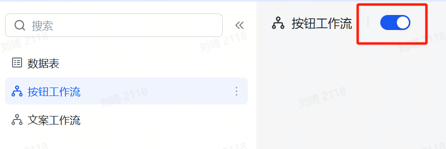
① Enable Workflows and Automations
Previously, some friends got stuck with the Xiaohongshu cover table and couldn’t generate prompts properly becauseworkflows were not enabled.
After creating a new table from a template in Feishu Multidimensional Spreadsheet, all enabled workflows and automations are automatically turned off and need to be manually enabled.
Workflow operation is very simple. As shown in the image below, just turn on the workflow switch.
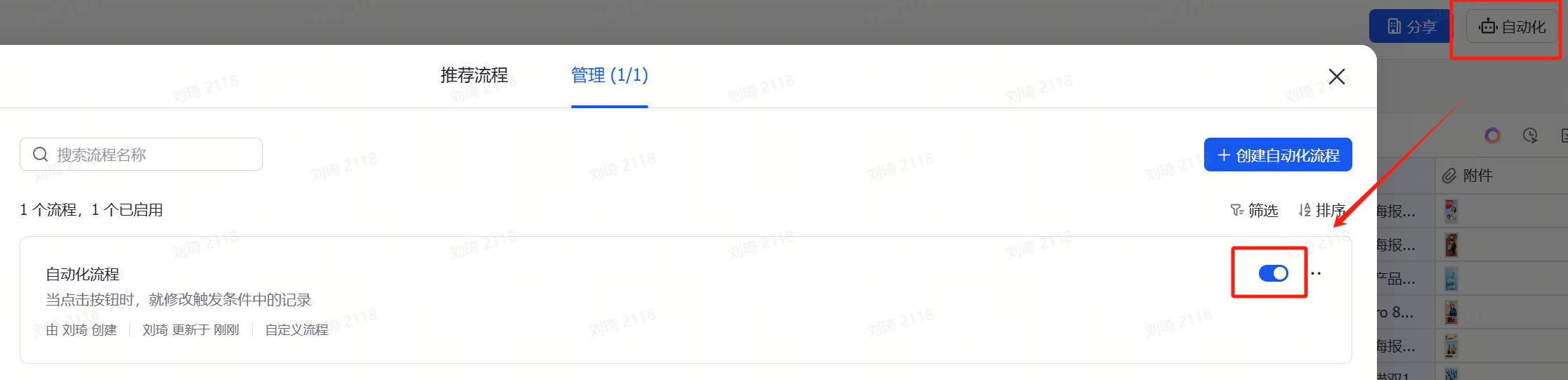
Unlike the previous Xiaohongshu cover table, this time we have a button automation, which is not a workflow, so it’s not in the left sidebar list. Instead, it needs to be enabled in theAutomation Center, as shown in the image below.
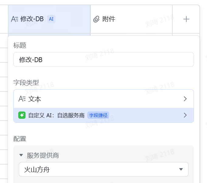
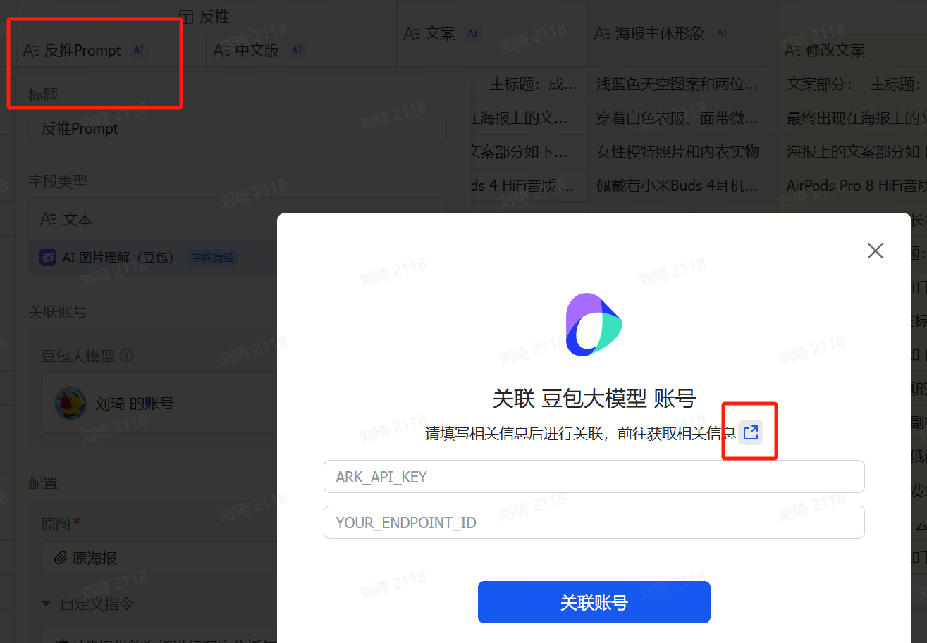
② Apply for and Replace API
The AI field shortcut only supports directly filling in an API KEY. Additionally, since some slower learners still need time to master the use of AI field shortcuts, I’ve kept my own API KEY access point in the template, which is still active for now. However, to prevent misuse, Ihave set some limits on the concurrency performance and quota of this access point; and as more people use the template, token consumption is increasing. Currently, it’s only a few hundred thousand tokens per day, which isn’t costly. But if more people use it, Icannot guarantee this API KEY will always remain active. Therefore, it is recommended that friends who can configure their own API switch to their own. On one hand, there will be no performance restrictions; on the other hand, it leaves the quota for those who genuinely have difficulty with configuration. After registering on Volcano Ark, the platform will directly provide some free credits.
Double-click the field name directlyto modify it. You can see how to get the API in my article on the Volcano Ark section:DeepSeek server always busy? Don’t want to wait? Try extending your chat’s life through the API.
Also, if you reverse-engineer many images, after the free image understanding model call quota provided by the multidimensional spreadsheet runs out, you will also need toactivate the vision model and bind your account on Volcano.
Follow the steps in the image below to find the official tutorial.
Formal Usage
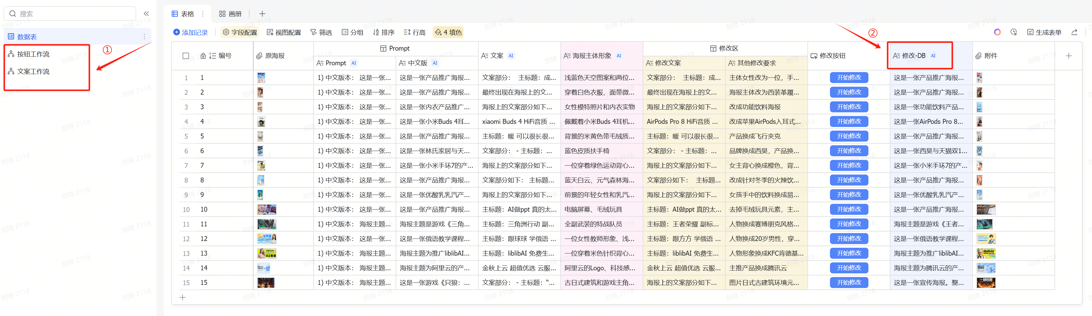
After opening the table, you can see these fields:
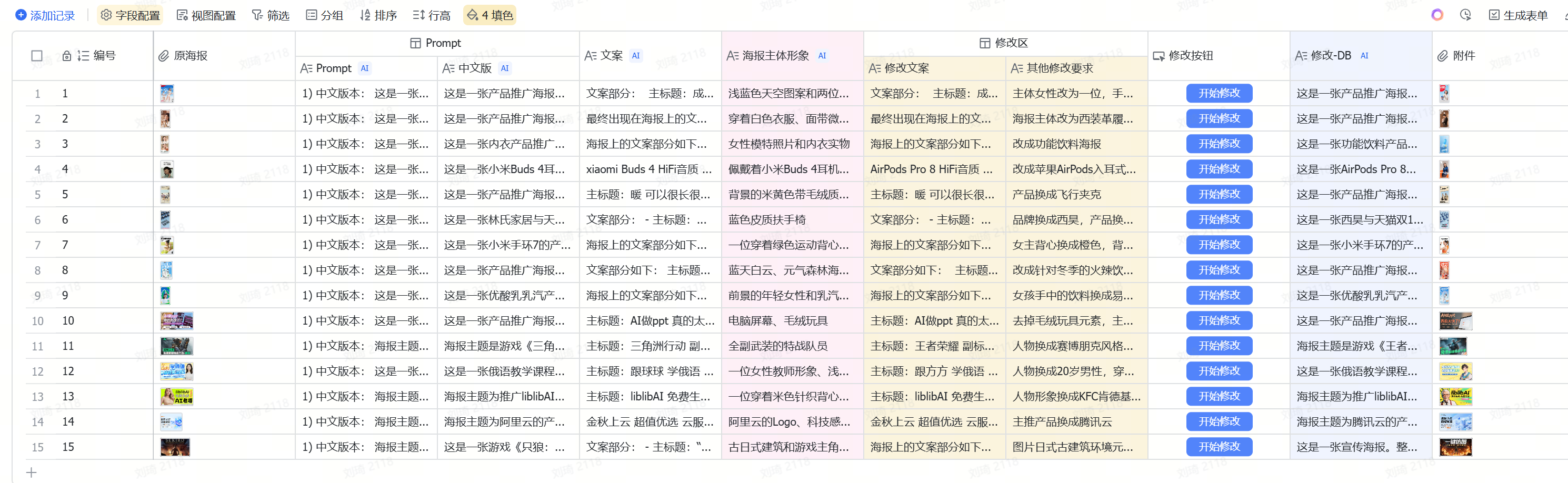
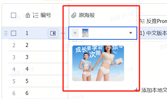
① Pleasepaste or directly uploadthe poster or image you want to reference in the “Original Poster” location.
② The AI field shortcut will automatically operate,generate a reverse-engineered prompt, and extract thetext copyandmain subject imagery。
 from it.
③ In the modification area, manuallyadjust the text of the copy, and put forward。
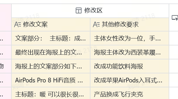 modification requestsfor image details and style.。
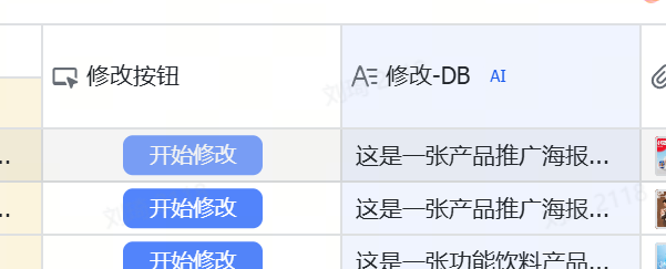
④ Click the “Start Modification” button, and the modification field on the right willautomatically generate a prompt that can be used for image generation.
⑤ Finally, copy this prompt to the Jimeng/Doubao platform for image generation. These two platforms offer
dozens
of free image generation attempts daily.
I have included 15 full-process practical cases in the template; you can also refer to them for operation.
Case Demonstrations
 Next, let’s run through a few actual cases.
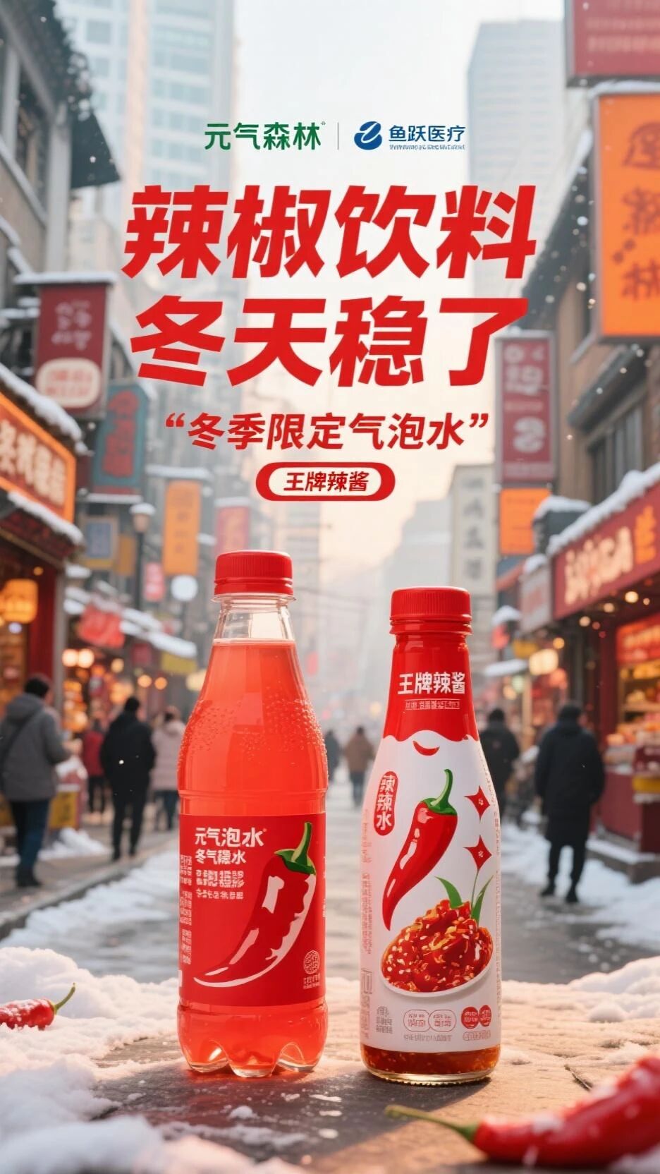
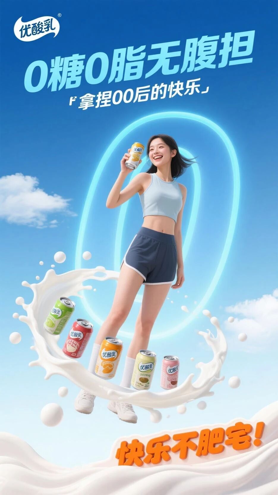
Demonstration Case OneFor example, this is an original poster of You Suan Ru (Yogurt Drink).
We upload it to the “Original Poster” location.
Then the AI field shortcut runs automatically and extracts the text from it:
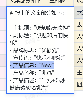
The text on the poster is as follows: - Main title: "0 Sugar 0 Fat No Burden" - Subtitle: "Mastering Gen Z's Happiness" - Brand logo: "You Suan Ru" - Slogan: "Happy, Not Fat" - Product Info: "New" - Product Name: "Ru Qi (Milk Soda)" - Product Description: "Milk + Soda, Healthy Carbonated Drink Ru Qi"
After these texts are extracted, they are automatically written into the yellow “Modify Copy” section.
Then we can directly edit the copy in the “Modify Copy” section.
For example, if I don’t like the “NEW” tag on the poster, I delete “NEW” from this text.Meanwhile, the main subject imagery in the poster is also identified, including:the young woman in the foreground and the Ru Qi product, the blue sky, white clouds, and green and yellow geometric shapes in the background
These are elements with a high proportion in the image, and they are what we can modify.
For example, I want to emphasize the。
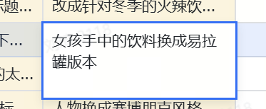
Ru Qi product
in the girl's hand. Ionly want the “can” version.
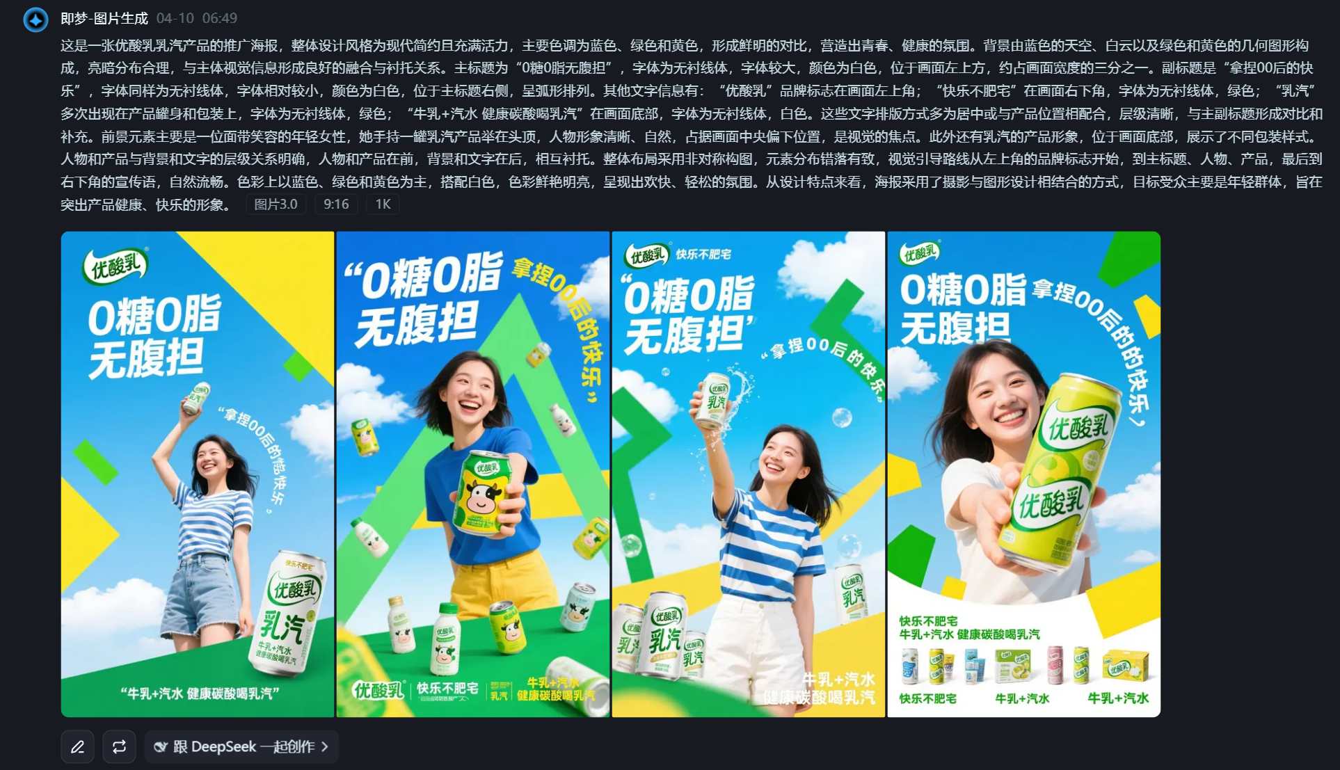
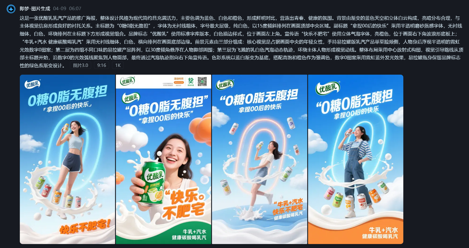
Clicking the “Start Modification” button, we get the image generation prompt:This is a promotional poster for You Suan Ru’s Ru Qi product. The overall design style is modern, minimalist, and vibrant, with main colors being blue, green, and yellow, creating a strong contrast and a youthful, healthy atmosphere. The background consists of a blue sky, white clouds, and green and yellow geometric shapes, with a reasonable light-dark distribution that blends well with and sets off the main visual elements. The main title is “0 Sugar 0 Fat No Burden,” in a sans-serif font, large size, white color, located in the upper left of the image, occupying about one-third of the image width. The subtitle is “Mastering Gen Z’s Happiness,” also in a sans-serif font, relatively smaller, white, positioned to the right of the main title in an arc arrangement. Other text includes: the “You Suan Ru” brand logo in the upper left corner; “Happy, Not Fat” in the lower right, sans-serif font, green; “Ru Qi” appears multiple times on the product can and packaging, sans-serif font, green; “Milk + Soda, Healthy Carbonated Drink Ru Qi” at the bottom, sans-serif font, white. The text layout is mostly centered or coordinated with the product position, with a clear hierarchy, contrasting and complementing the main and subtitles. The foreground element is mainly a smiling young woman holding a can of Ru Qi product above her head, her figure clear and natural, occupying the central-lower part of the image, serving as the visual focus. Additionally, there is the Ru Qi product imagery at the bottom, showcasing different packaging styles. The relationship between the figures/products and the background/text is clear, with figures and products in front, and background and text behind, setting each other off. The overall layout uses an asymmetrical composition, with elements arranged in a staggered yet orderly manner. The visual guidance flows naturally from the brand logo in the upper left, to the main title, the figure, the product, and finally to the slogan in the lower right. The colors are mainly blue, green, and yellow, paired with white, bright and vibrant, presenting a cheerful and relaxed atmosphere. In terms of design features, the poster combines photography and graphic design, targeting a young audience, aiming to highlight the product’s healthy and happy image.
Copy to Jimeng, generate the image:
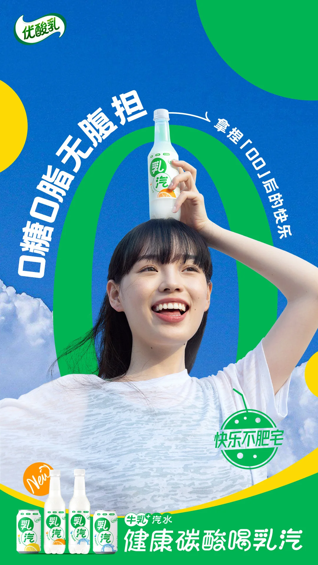
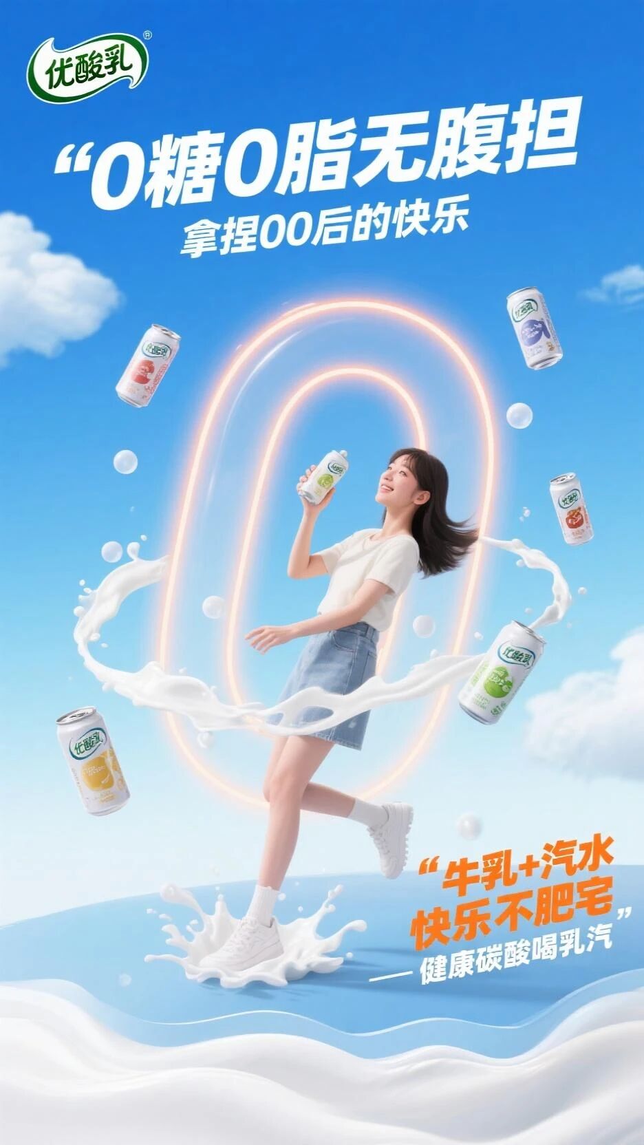
The “NEW” tag was successfully removed, and the drink in the girl’s hand was changed to the can version.But that’s not all.
Comparing with the original poster, the green pattern behind the girl in the original is actually the number “0,” which should echo the 0 sugar, 0 fat in this poster.
TheDoubao image understanding model we used failed to understand
 this. But I think this number “0” is very creative and I want to keep it.
What to do? Simple.
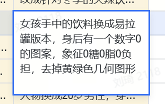
We
go back to the "Other Modification Requirements"to add more details.
Clearly tell the AI that there should be a number 0 pattern behind the girl, symbolizing 0 sugar, 0 fat, 0 burden, and that the yellow and green geometric shapes are a bit ugly and I don’t want them.
Click the button again to regenerate the prompt.
Now we get a new prompt:
This is a promotional poster for You Suan Ru’s Ru Qi product. The overall design style is modern, minimalist, and vibrant, with main colors being blue, white, and orange, creating a strong contrast and a youthful, healthy atmosphere. The background consists of a gradient blue sky and three-dimensional white clouds, with a reasonable light-dark distribution that sets off the main visual elements well. The main title is “0 Sugar 0 Fat No Burden,” in a sans-serif bold font, the largest hierarchy, pure white, arranged at a 15-degree tilt in the top central area of the image. The subtitle “Mastering Gen Z’s Happiness” uses a semi-transparent frosted texture font, sans-serif thin weight, white, arranged around below the main title to form a visual combination. The brand logo “You Suan Ru” uses the standard library version, white outline style, located in the upper left corner. The slogan “Happy, Not Fat” uses a 3D bubble font, bright orange, on a wave-shaped base in the lower right corner; “Milk + Soda, Healthy Carbonated Drink Ru Qi” uses a sans-serif thin font, white, arranged horizontally along the bottom edge of the image. The foreground consists of three parts: the core visual is a young woman in the center of the image, holding a can version of the Ru Qi product to her cheek, with a semi-transparent neon light effect number 0 pattern floating behind her; the second layer is an array of four different flavor can products, suspended at a 30-degree angle around the figure’s feet; the third layer is splashing milky white bubble dynamic trajectories, surrounding the main figure to form a visual flow. The overall layout uses a radial composition from the center, with the visual guide starting from the main title at the top, focusing on the figure’s face along the neon light arc of the number 0, and finally pointing to the slogan in the lower right through the bubble trajectories. The color system is based on a blue-white gradient, complemented by high-saturation orange as an accent color, the number 0 pattern uses a neon blue outer glow effect, and the bottle retains the brand’s iconic green gradient design.
The generated image looks like this:Controlling copy + controlling elements + modifying images with voice.Demonstration Case Two
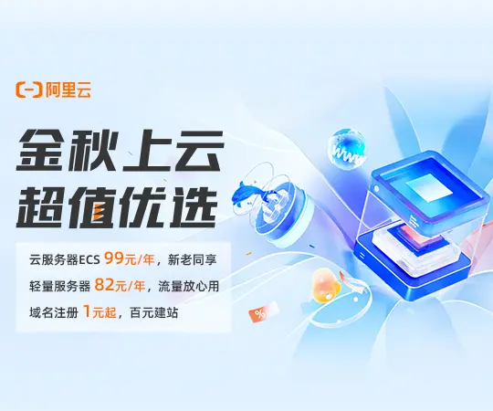 Suppose now Alibaba Cloud is our client, and we need to promote it on a traffic platform via information flow advertising.
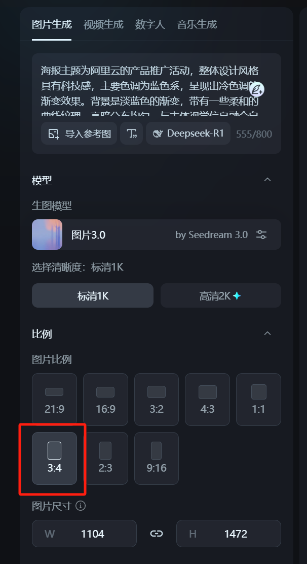
The image ad placement on this platform is a
3:4 ratio display slot, but we currently only have a nearly square rectangular design asset, and the designer has no time to redo it for us.
What to do? Don’t worry.
We upload the existing image to the “Original Poster” location in the table. The AI automatically reverse-engineers the prompt:
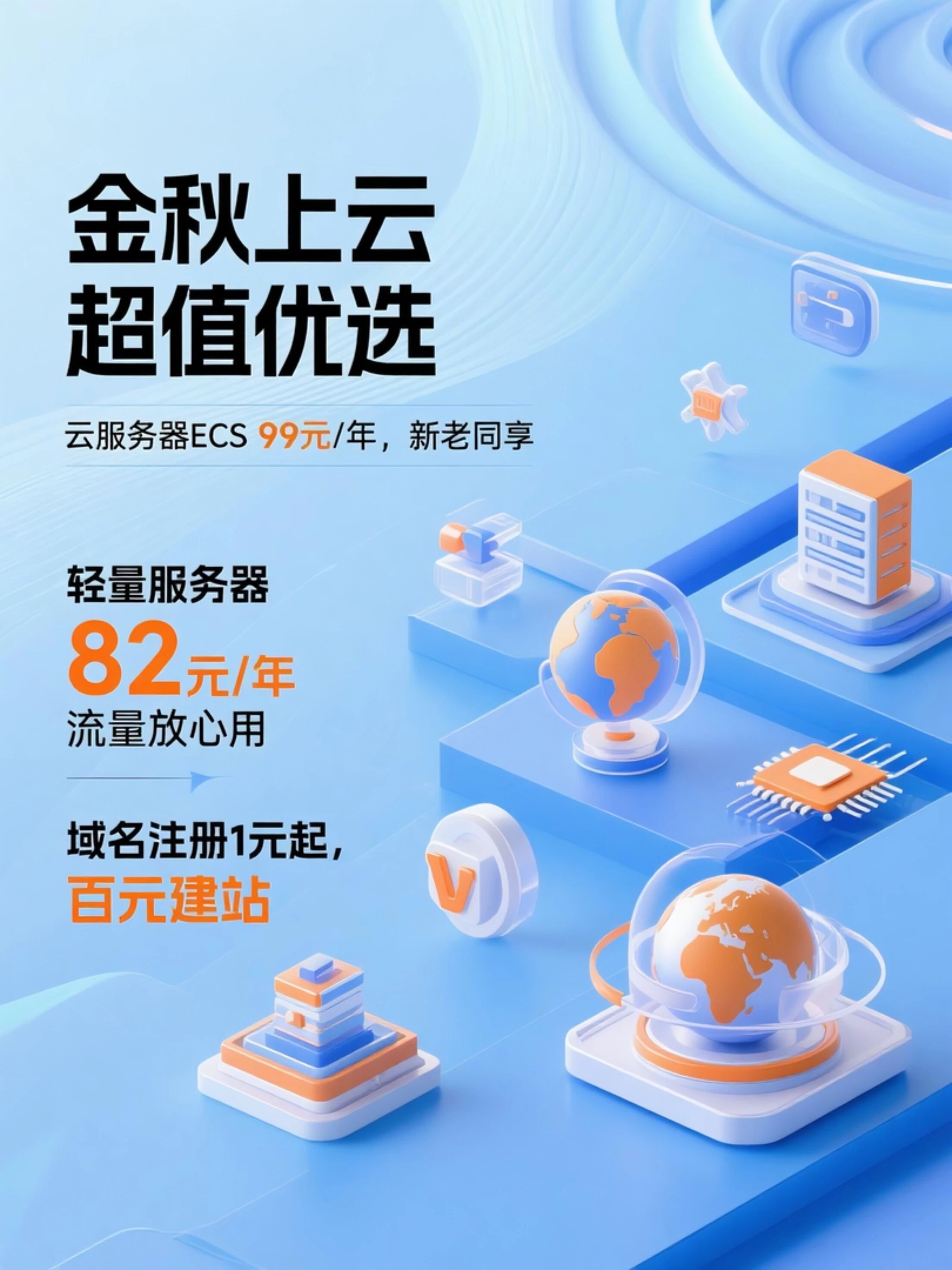
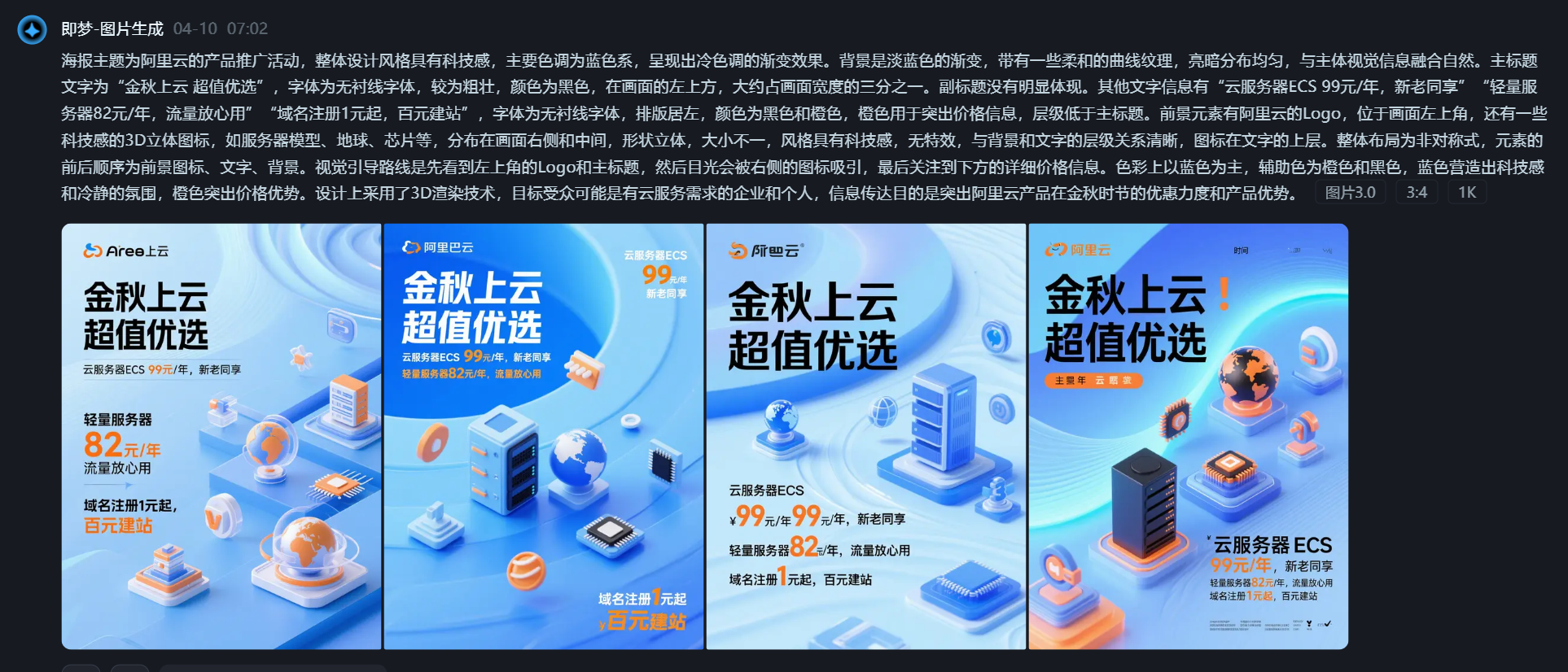 The poster’s theme is Alibaba Cloud’s product promotion event. The overall design style has a technological feel, with the main color tone being blue, presenting a cool-toned gradient effect. The background is a light blue gradient with some soft curved textures, the light-dark distribution is even, and it blends naturally with the main visual elements. The main title text is “Golden Autumn Cloud, Super Value Choice,” in a sans-serif font, fairly bold, color black, located in the upper left of the image, occupying about one-third of the image width. There is no obvious subtitle. Other text information includes “Cloud Server ECS 99 yuan/year, for new and old customers,” “Lightweight Server 82 yuan/year, worry-free traffic,” “Domain Registration starts at 1 yuan, build a site for 100 yuan,” font is sans-serif, left-aligned layout, colors black and orange, orange used to highlight price information, hierarchy lower than the main title. Foreground elements include the Alibaba Cloud logo, located in the upper left corner, and some tech-style 3D icons, such as server models, globe, chips, etc., distributed on the right and middle of the image, three-dimensional shapes, varying sizes, tech-style, no special effects, clear hierarchy with the background and text, icons above the text. Overall layout is asymmetrical, with the order of elements being foreground icons, text, background. The visual guide first sees the logo and main title in the upper left, then the eye is drawn to the icons on the right, and finally to the detailed price information below. Colors are mainly blue, with orange and black as auxiliary colors. Blue creates a technological and calm atmosphere, orange highlights the price advantage. Design uses 3D rendering technology, target audience likely enterprises and individuals needing cloud services, communication purpose is to highlight Alibaba Cloud’s product discounts and advantages during the golden autumn season.
We copy this prompt directly to Jimeng, select the target 3:4 ratio:
The 3:4 image is generated like this:
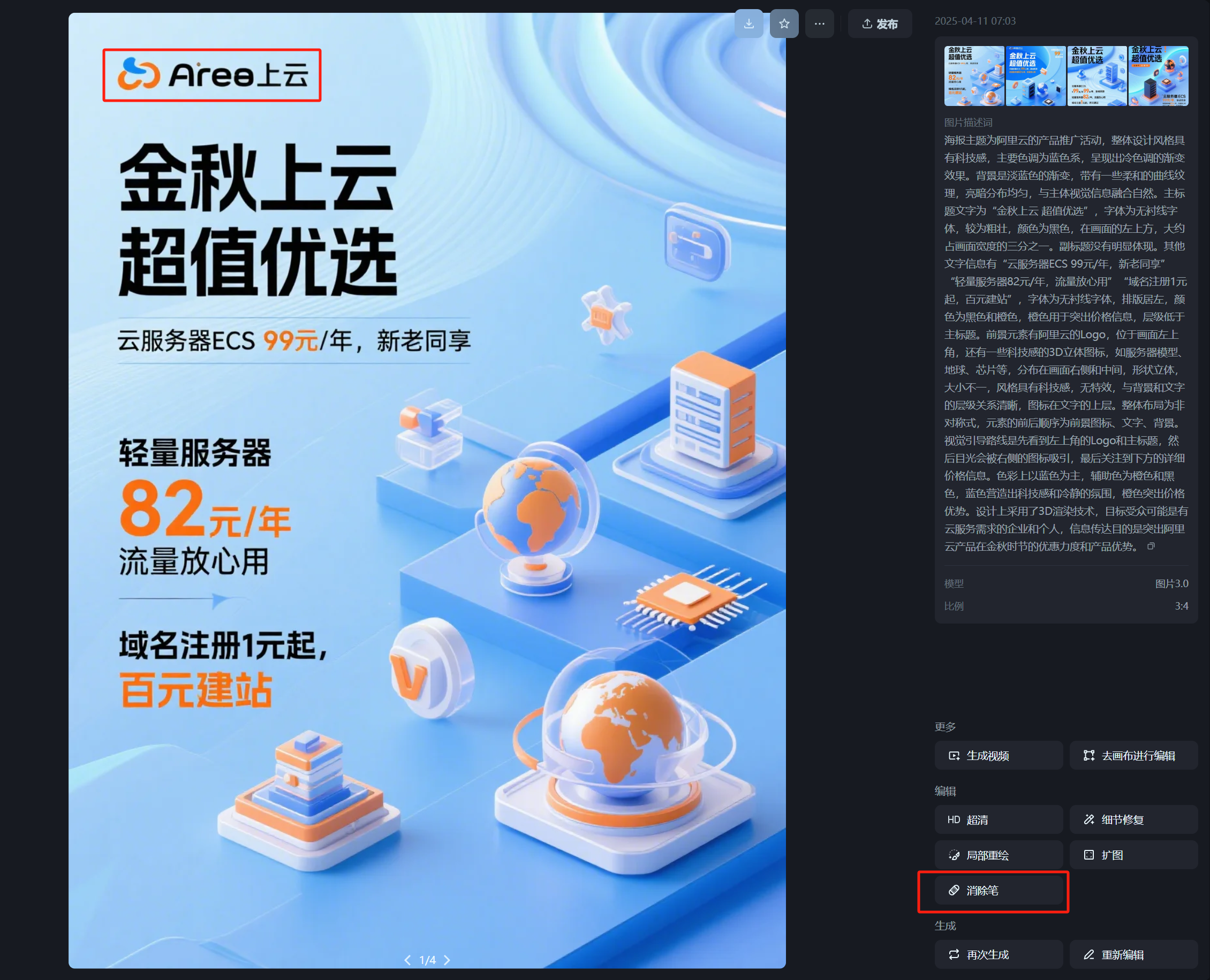
Choosing a relatively good one, I notice the generated results from Jimeng still have noticeable flaws in the brand logo area.
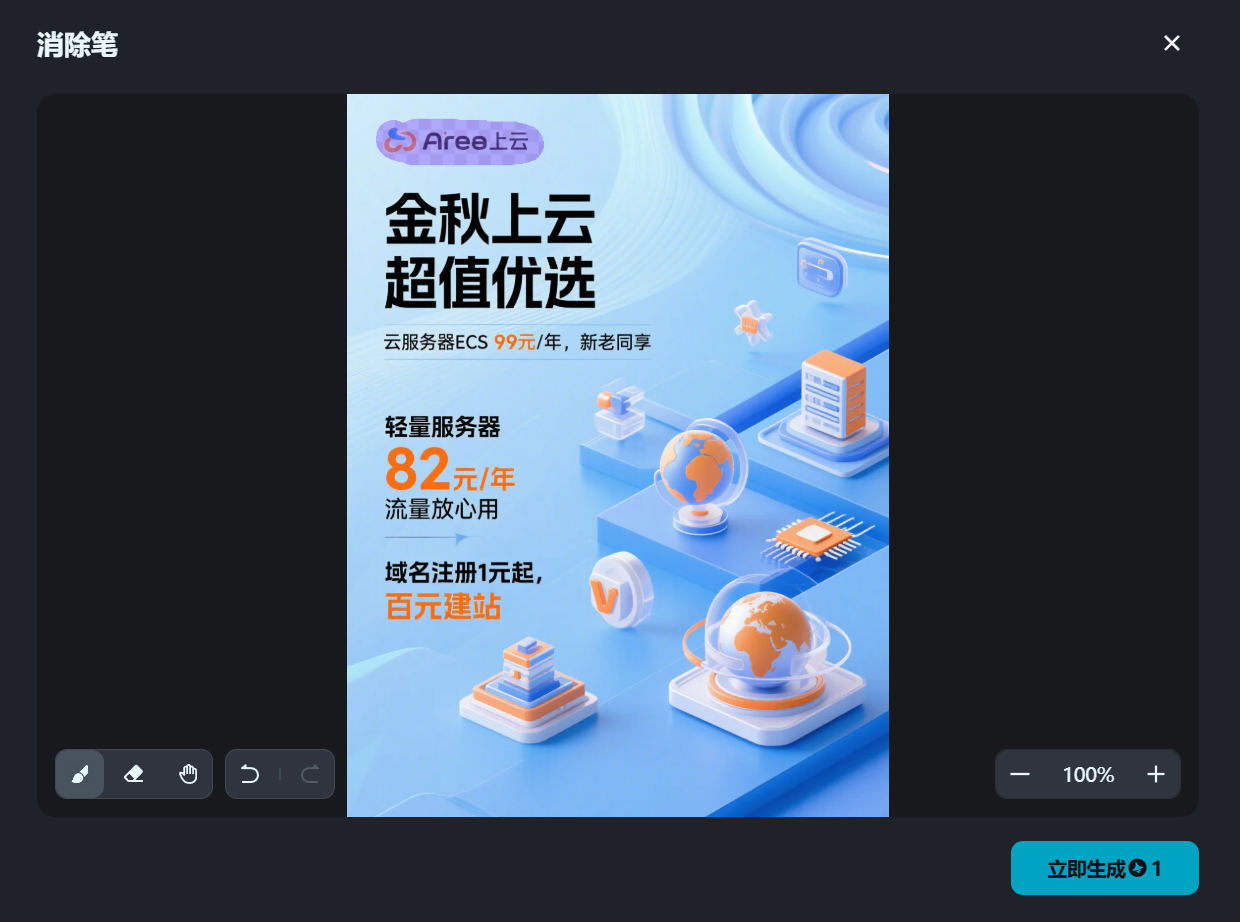
But this is not a big deal at all. Find the “Eraser” tool in the lower right tools, and we paint over the incorrect parts.
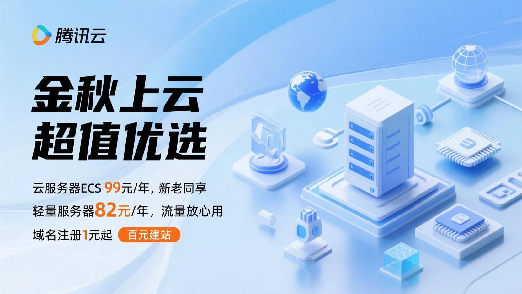
Then regenerate it again:
Now the flawed parts are removed:
Next, just find any image editing tool to add the Alibaba Cloud logo to the upper left corner. Of course, if modifications are needed, that’s also entirely possible.
For example, we can change it to Tencent Cloud:
The logo is still processed using the same method as before.
 PS: If you are truly in a client service scenario, regardless of how similar the AI-generated result looks to the real thing, I recommend you re-process elements with strict standards like logos and products, and replace them with accurate assets. This is responsible to the client and to yourself.
 Demonstration Case Three
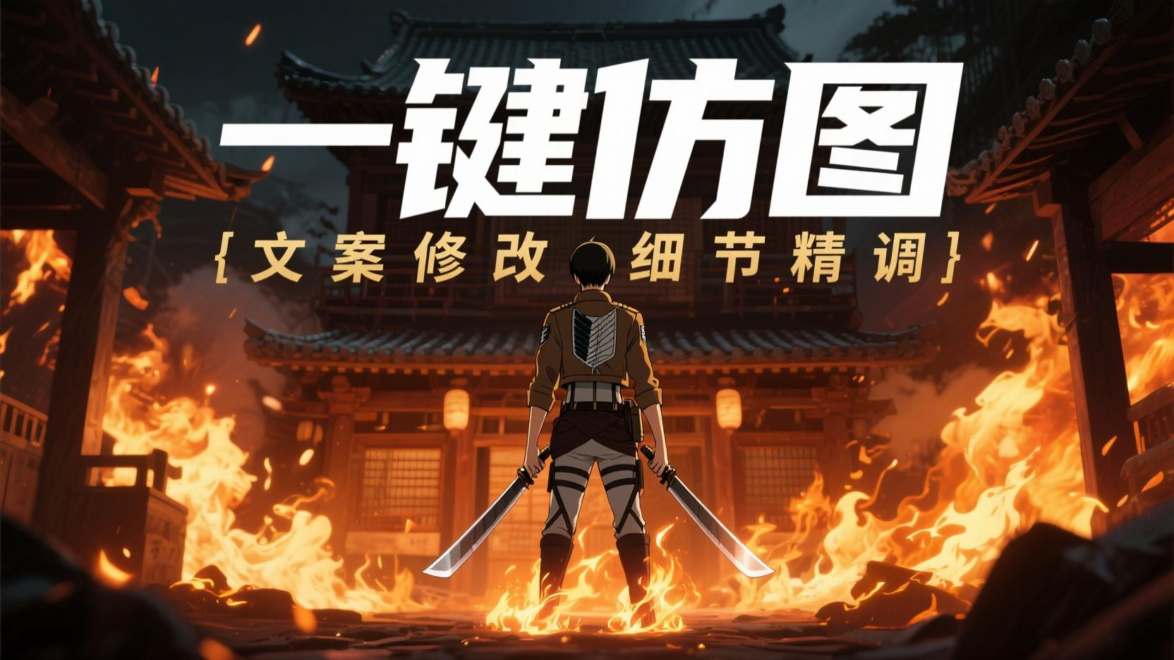
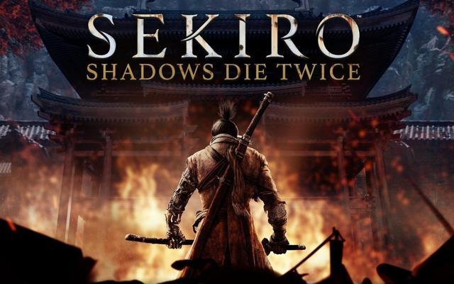
This is the title image of this article:
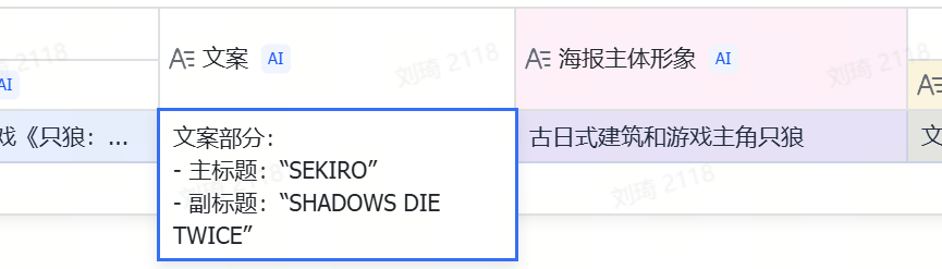
Although I've modified it beyond recognition, its original version is actually... "Sekiro: Shadows Die Twice":Upload the original image for reverse-engineering. I won’t paste the prompt here. Simultaneously, we also get the text copy and the main subject imagery of the poster:
In the final new image, the text, character, and art style have all changed.
The text is simplest; we directly modify the main and subtitles in the "Modify Copy" section to:
Main title: One-Click Image Imitation
Subtitle: Copy Modification, Detail Refinement
Other modifications go into the "Other Modification Requirements" section.
First, I want to keep the burning ancient Japanese-style building, so I can write:
Keep the Japanese ancient building environmental elements in the image unchanged
I want the art style to become that of Attack on Titan.
If the image generation model we're using now is GPT-4o, directly naming it is actually the best choice.
But the model we're using now is Jimeng 3.0, which indeed has a gap in understanding compared to GPT-4o.
So we can do this:
Change the overall art style to that of the Attack on Titan animation (please describe this art style)
Ask the AI to specifically describe the target animation's art style in the prompt.
The AI indeed provides feedback:
Based on distinct lines, strong light-shadow contrast, and expressive, tense visuals.
Next, for the character, we ask the AI to replace Sekiro's samurai image with the image of Captain Levi:Replace the original samurai image with the image of Captain Levi from the animation, weapon is dual blades held in hands, no need to carry swords on back
The above few pieces of content combined form the “Other Modification Requirements.”
Then, clicking the button, we get the final image generation prompt:This is a promotional poster. The overall design style leans towards the art style of the Attack on Titan animation, characterized by distinct lines, strong light-shadow contrast, and expressive, tense visuals. The main colors are dark tones with warm firelight contrast. The poster’s background is an ancient Japanese-style building engulfed in intense flames, creating a tense and dangerous atmosphere. The main background color is a dark, murky gray-black tone, with brighter areas at the fire. The main title is “One-Click Image Imitation,” in a capitalized font style reminiscent of Attack on Titan animation, fairly bold, white, located in the middle upper part of the image, occupying about one-third of the image width; the subtitle is “Copy Modification, Detail Refinement,” also in Attack on Titan animation font style but slightly thinner, gold, positioned below the main title, aligned top and bottom with it. The foreground element is the back view of Captain Levi from Attack on Titan, wearing attire similar to the Survey Corps, holding dual blades in both hands, standing in the center of the image, occupying a large proportion of the image. The figure’s edges are highlighted by firelight, making it stand out more, forming a hierarchical relationship with the background building and flames, with the figure in front and the background behind. The overall composition is asymmetrical, with the visual guide first seeing the central character, then looking up to see the main and subtitles, and finally noticing the building and flames in the background. The main colors are dark, murky black-gray and bright firelight orange-yellow, with auxiliary colors of white and gold for text, creating a mysterious, tense, and battle-filled atmosphere. The poster adopts a painting style similar to the Attack on Titan animation, with impactful visuals, targeting audiences who like anime styles and related themes, aiming to highlight a unique visual style and tense atmosphere.
。
Prompt
Then, generate the image:At this point, you should already understand the operational logic of this image imitation table.
If you want to see more cases, you candirectly open the table to view the other cases I left in the table.The prompt for image reverse-engineering is also placed here. Interested friends can use it directly or make secondary optimizations.
This prompt was originally written last year when I used ComfyUI workflow for FLUX.1 poster reverse-engineering. Later, it was optimized by Claude and o1, and this is now the 3rd version.
By default, it can outputbilingual Chinese and English descriptions
, and the structure is more&natural language-oriented&, in line with the style of current new image generation models. I think it has reached a relatively usable state and share it with everyone:Enjoy。