Let’s get straight to the point; here is the template first:
You can probably figure out the usage from the screenshot. The manual part is entering the article title and selecting a desired style. Then, everything else is automated. The AI will output a Prompt for generating the cover based on your input, and then it calls the Seedream 3.0 image generation model via the image generation field shortcut (of course, you can also copy the Prompt directly to Jimeng/Doubao) to generate the final cover image.
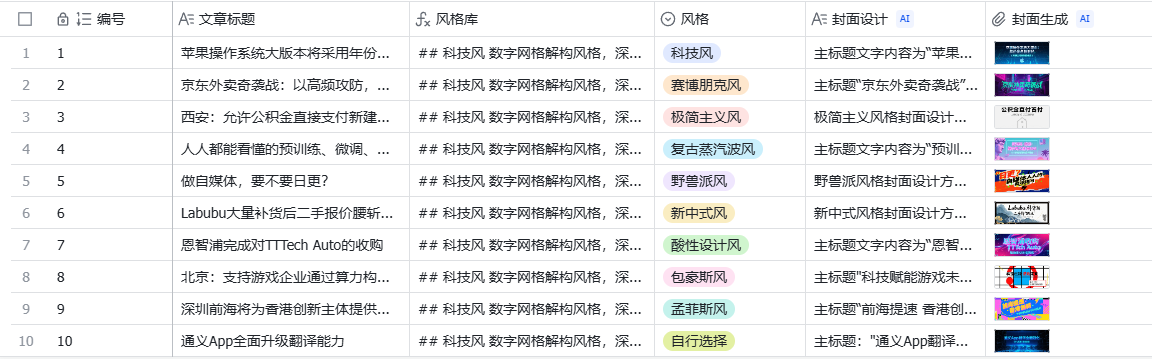
Like this:

Simple, right!
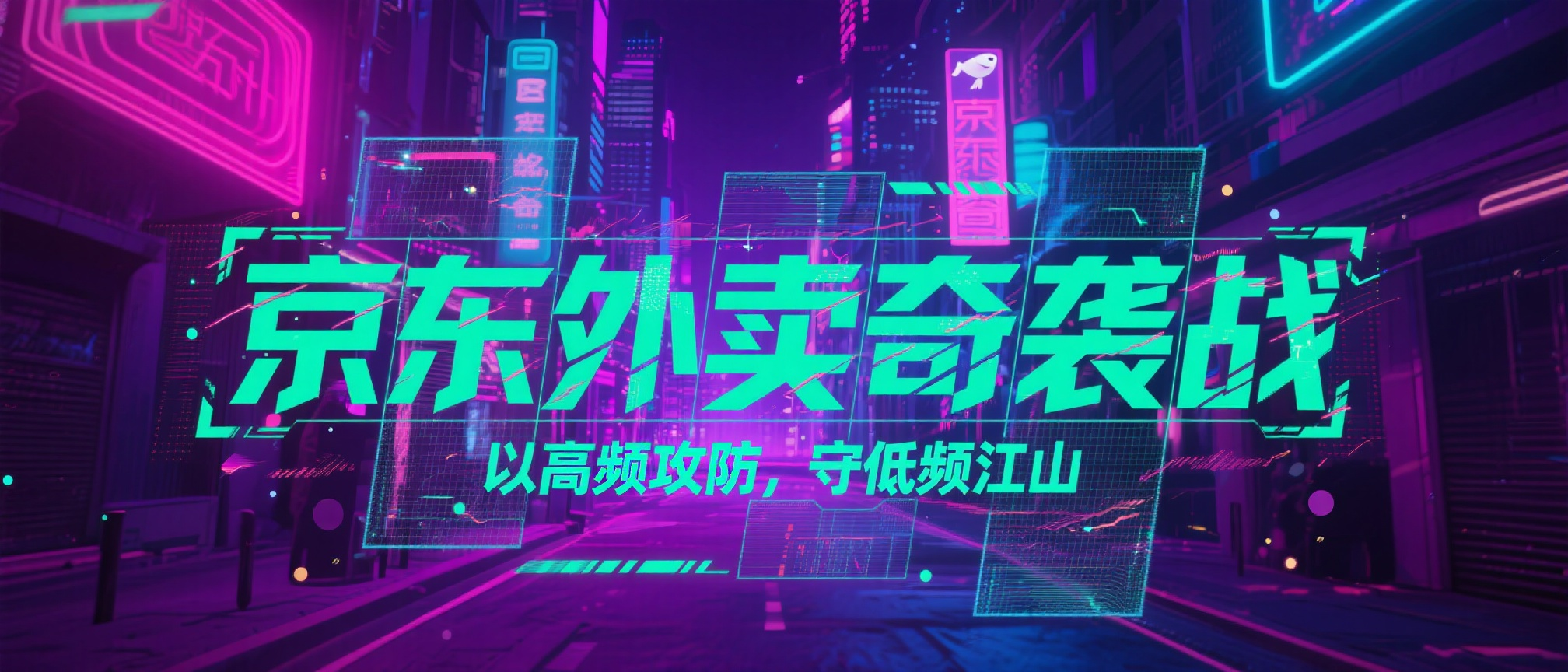
After explaining how to use it, let’s talk about how to build it.
If you break down the entire table template, you’ll find the workflow behind it is very simple.
There are two core Prompts in total.
The first part is responsible for generating the image-generation Prompt:
Please refer to the WeChat public account article title [article title] and design a cover image for it in the [style] style. Your design plan should sequentially include the following content:

# Text Part
The cover image text can be refined and interpreted in conjunction with the article title, ensuring clear and prominent information delivery; it does not have to be completely identical to the article title. Unless necessary, do not add other text information outside the main and subheadings.

## Main Title
- List the main title text content; if there are multiple languages, indicate each one.
- Specify the font style, type (serif/sans-serif/handwritten/cartoon, etc.), size ratio, and color scheme (solid color/gradient/metallic texture, etc.). The font design can refer to the style library below based on the poster design style.
- Location description: You can use the nine-grid positioning or clock direction, and estimate the proportion of the width or height of the picture as a percentage.

## Subheading
- Record the subheading content and its font characteristics, size, and color.
- Explain its typographic relationship with the main title (staggered up and down, left-right alignment, color contrast, etc.) and its spatial position in the picture.

## Other Text Information
- List all text other than the main and subheadings.
- For each text item, note the font type, layout method (left-aligned/centered/columnar, etc.), color combination, and hierarchy or contrast relative to the main and subheadings.

# Cover Background
- Describe in detail the patterns, textures, or image elements of the cover background (such as geometric lines, landscapes, gradient overlays, etc.).
- Describe the main color of the background, the light-dark distribution, and its fusion or contrast with the main text information.

# Text Decorative Elements
- Please understand the content in conjunction with the article title; based on your understanding, describe the decorative elements around the text (such as underlines, borders, light effects, shadows, etc.).
- Clarify the position distribution of decorative elements in the picture and explain their visual relationship with the text subject (setting off, emphasizing, guiding, etc.).

# Layout & Hierarchy
- Summarize the overall composition method (symmetrical/asymmetrical, white space, grid layout, etc.) and the front-to-back order of the elements.
- If you can identify the visual guidance route (where the viewer looks first, then where), please explain.

# Color & Mood
- Mention the combination of main and auxiliary colors (complementary, analogous, soft/vivid, etc.), or the presence of special gradients, light and shadow changes.
- Infer the overall emotion or tone the cover aims to present (solemn, romantic, passionate, mysterious, etc.).

# Design / Technical Features
- If you can determine that the cover uses photography, 3D rendering, digital painting, or special post-processing (such as grain, faux-old texture, neon style), please describe it.

Output format: Please output the above points sequentially in one natural paragraph, describing as accurately as possible with concise language. Only output the design plan results; do not add subheadings and format explanations, and do not include any other descriptive and explanatory text. Note that the text content on the cover should be enclosed in double quotes, and it is prohibited to fabricate names or times that do not appear.
This part limits the image presentation form and contains two key pieces of information:
①It introduces the information input of [article title] and [style].
This way, the final output cover design is associated with your article and the style you want.
②It specifies what elements should be included in the picture, such as main title, subheading, cover background, text decoration, color mood, etc. Together, these elements form a “big-character poster” style public account cover.
If you no longer want a public account cover and wish to generate a poster instead, you only need to modify these elements. You can change the text decoration into a main object or main character, so you can get a poster with a product image or a model image on it.
For example, I added this short paragraph to the meta-Prompt above:
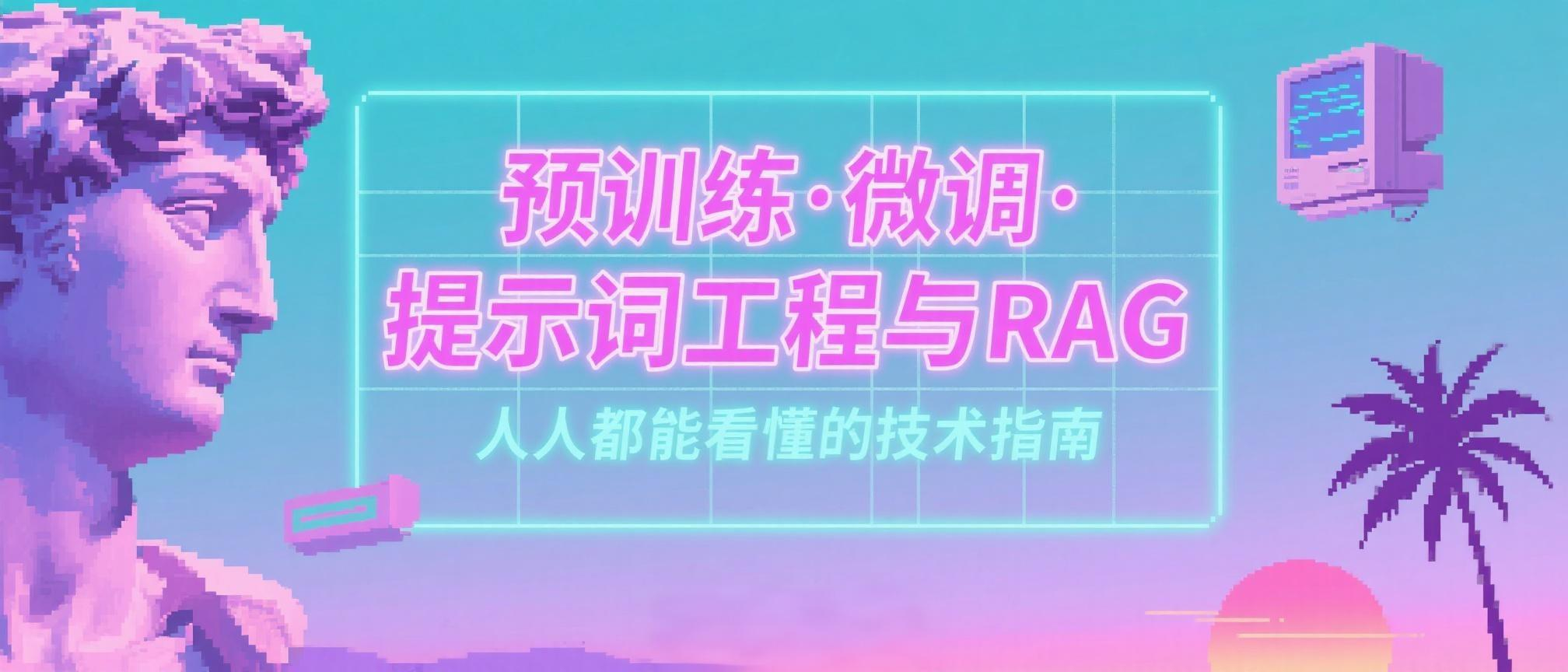
# Main Character - A beautiful female character with a technological feel.Regenerating the image-generation prompt for “Tongyi App Comprehensively Upgrades Translation Capability” and selecting a 3:4 image ratio for generation, I got this poster:

The second part defines the style of the generated image:
# Style Library
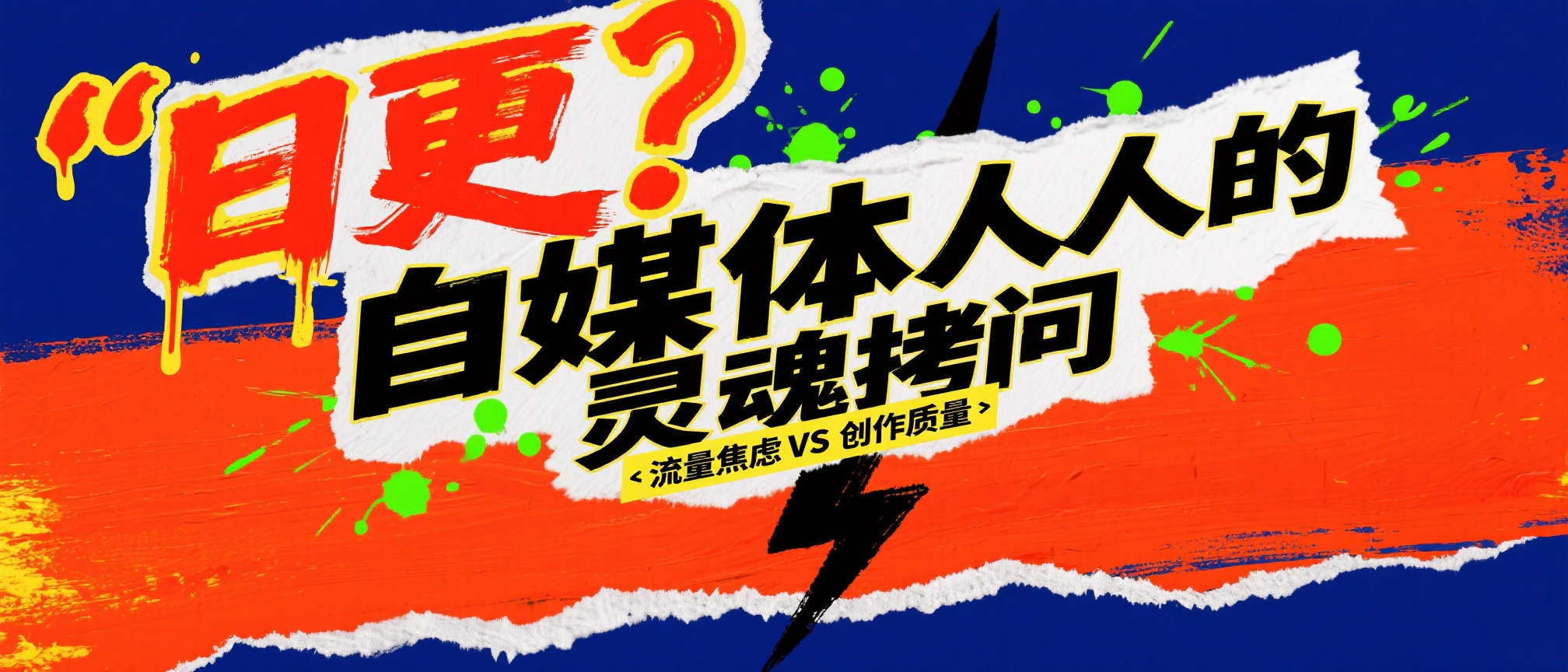
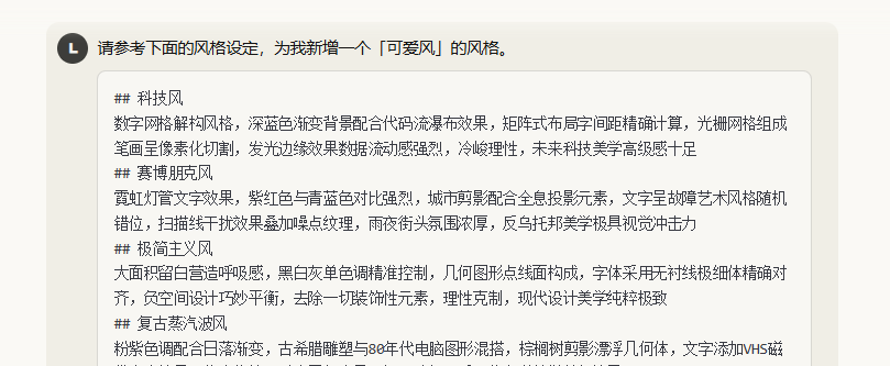
## Tech Style
Digital grid deconstruction style, deep blue gradient background paired with code waterfall effect, matrix layout with precise character spacing, raster grid strokes in pixelated cut, glowing edge effect with strong data flow, cold and rational, high-end futuristic tech aesthetic
## Cyberpunk Style
Neon tube text effect, strong contrast between magenta and cyan-blue, city silhouette with holographic projection elements, text in glitch art style with random misalignment, scan line interference effect overlaid with noise texture, strong rainy night street atmosphere, dystopian aesthetic with great visual impact
## Minimalist Style
Large areas of white space to create a sense of breathing, precise control of black, white, and gray single tones, geometric figures with point, line, and plane composition, font using ultra-thin sans-serif with precise alignment, clever balance of negative space design, removal of all decorative elements, rational and restrained, pure and ultimate modern design aesthetic
## Retro Vaporwave Style
Pink-purple tone paired with sunset gradient, mix of ancient Greek sculptures and 1980s computer graphics, palm tree silhouette floating with geometric bodies, text with VHS tape distortion effect, pixelated processing fused with neon halo, nostalgic and psychedelic, dreamy and eerie postmodernist aesthetic
## Fauvism Style
Rough brushstroke texture with strong feel, bold collision of high-saturation primary color blocks, handwritten text in irregular layout, free and unrestrained paint splash and splatter effect, torn collage elements breaking conventional composition, primitive impulse, wild and unruly expressionist aesthetic
## New Chinese Style
Rich layers of ink wash effect, interplay of ink shades between density and lightness, modern geometric reconstruction of traditional patterns, calligraphy font combined with minimalist English layout, profound artistic conception of white space with swirling mist, gold foil accents to enhance texture, oriental zen, elegant and restrained contemporary oriental aesthetic
## Acid Design Style
Fluorescent color system with explosive saturation, liquid metal texture with flowing deformation, 3D twisted and expanded letters, gradient grid overlaid with psychedelic texture, laser holographic effect with strong dizziness, melting and dripping with full dynamics, surrealism, bizarre and avant-garde post-digital age aesthetic
## Bauhaus Style
Three primary colors combined with black, white, and gray for rational color matching, precise composition of basic geometric shapes like circles, squares, and triangles, precise control of layout with a grid system, font using classic sans-serif with modular arrangement, minimalist functionalist design, strong industrial aesthetic, timeless modernist aesthetic
## Memphis Style
Bold combination of bright yellow, pink, and mint green, random distribution of irregular geometric patterns, mix and match of polka dots, stripes, and checkered elements, offset stacking of 3D shadows, tilted and rotated fonts breaking balance, highly decorative, playful postmodernist aestheticWhy are the two previous images about the Tongyi App translation upgrade so consistent in style? It’s because this part is at work.
When I specify the image style as “Tech Style”, the generated images will all follow the settings defined in this Prompt for the tech style.
Here are a few more:
Right?
And in the table, for quick generation, we can directly set the style as a single choice.
What style you select is what style gets generated.
And, you can also set a little trick.
Directly add an option called “Choose by AI”.
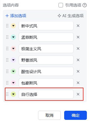
When it is substituted back into the first part of the Prompt, it becomes:
Refer to the WeChat public account article title [article title] and design a cover image for it in the [Choose by AI] style.This way, the AI can automatically choose a suitable style from the style library based on the article title.
So, what if the style library doesn’t have the style you want?
It’s very simple; just append the style you want below it.
If you don’t know how to write it, that’s also easy; let the AI write it for you.
For example, I now want to add a “Cute Style”.
Instantly, you get a “Cute Style” setting.
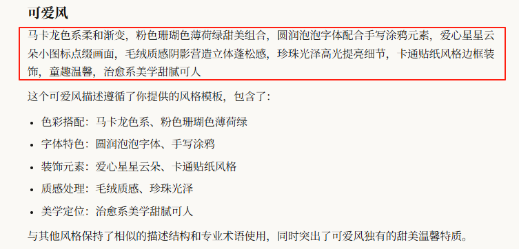
Select “Cute Style” and generate one:
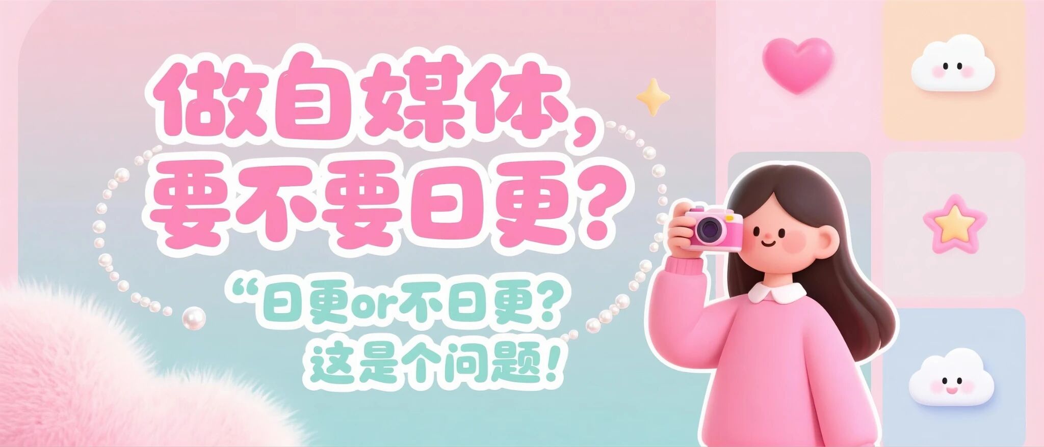
Hey, it even did a callback, because earlier in the first part of the Prompt, I added a main character – a female with a tech feel – so a girl with a camera appeared in the picture.
How about that, isn’t it simple?
Unlock your cover freedom!